I hang around a web-centric forum called WebDeveloper.com, which is run by Jupiter Media. To a large extent I try to answer questions and assist folks in creating web sites in the manner considered the best practice in the 21st century. As an adjunct to that I've considered writing up a tutorial describing my particular take on page construction. If I can pull it off within the confines of Blogger then that's what this article will eventually be.
I want to thank Cheval, another member of WebDeveloper.com for allowing me to use his basic design, code and image as a starting point. One of the hardest parts of doing something like this for me is coming up with a test design in the first place. Eventually the raw material from this project will be attached to a message in the original thread at WebDeveloper.
Recurring Themes
There are a couple of ideas that drive modern software development. First, that software development is an engineering practice more than it is an art or craft. In a nutshell, engineering is the consistent application of a set of standard techniques to solving problems. You recognize a kind of problem and you know what subset of all the tools you have available will best help you solve it.
The second idea is separation of concerns. In the case of web site development that comes down to separation of content from presentation. (Ok there is the third concern of behavior but we're ignoring that for now.) Content is expressed in a structured way in HTML. A web page is a structured document. The presentation of the content is handled by Cascading Style Sheets, CSS. CSS describes how the HTML content will look.
What have we got here?
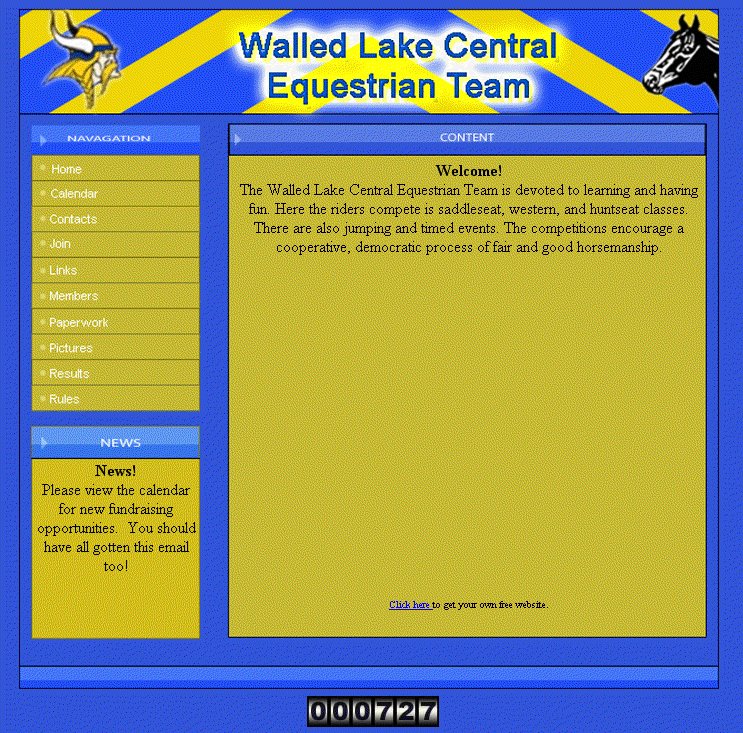
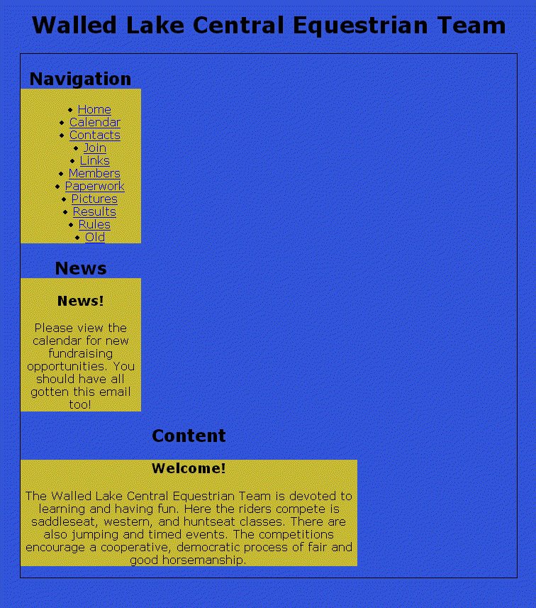
The initial implimentation was to use the image as-is with area tags and onclick handlers for the nav links. A couple of overlaid, absolute positioned divs formed the News and Content areas. Had this been worked up in old school fashion using the Adobe/Macromedia set of tools then the design image would have been sliced-n-diced into a dizzying array of unintelligable table cells and the site maintainer would have to revisit the complete design/construction cycle to do something as trivial as add another link to the nav bar. As it was the page sort of worked but those News and Content divs were misbehaving and that brought Cheval to the forums looking for help. Instead of patching around the problems I recommended he just go ahead and do the page "right" (and I reserve the right to define right the "right" way).
Content is King
Old school 20th century thinking starts with looking at the design and imagining how to write HTML to make a page that looks like that design. In other words, the trick was to code the presentation of the page in the HTML that also encodes the information (content) expressed in that page. Here in the new millenium the first thing we do is look at the design and imagine what the structure of the content should be on that page. When I looked at the test page online, here's what I saw.
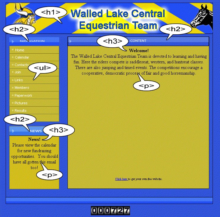 I saw headings, paragraphs and a list of links -- the semantic structure of the information presented on the page. Here is one way of marking up the page with semantic, structural HTML.
<!DOCTYPE HTML PUBLIC "-//W3C//DTD HTML 4.01//EN"
"http://www.w3.org/TR/html4/strict.dtd">
<html lang="en">
<head>
<meta http-equiv="Content-Type"
content="text/html; charset=iso-8859-1">
<meta name="Content-Script-Type" content="text/javascript">
<meta name="Content-Style-Type" content="text/css">
<title>Walled Lake Central Equestrian Team</title>
<style type="text/css">
html, body {
margin: 0;
padding: 0;
border: 0;
background: #fff;
color: #000;
font-family: Verdana, Geneva, Arial, Helvetica, sans-serif;
font-size: 1em;
}
</style>
</head>
<body>
<div id="wrapper">
<h1>Walled Lake Central Equestrian Team</h1>
<div id="nav">
<h2>Navigation</h2>
<ul>
<li><a href="/about.html">Home</a></li>
<li><a href="/calendar.html">Calendar</a></li>
<li><a href="/contacts.html">Contacts</a></li>
<li><a href="/join.html">Join</a></li>
<li><a href="/links.html">Links</a></li>
<li><a href="/members.html">Members</a></li>
<li><a href="/paperwork.html">Paperwork</a></li>
<li><a href="/pictures.html">Pictures</a></li>
<li><a href="/results.html">Results</a></li>
<li><a href="/rules.html">Rules</a></li>
<li><a href="/news.html">Old</a></li>
</ul>
</div>
<div id="news">
<h2>News</h2>
<div>
<h3>News!</h3>
<p>Please view the calendar for new fundraising
opportunities. You should have all gotten this email too!
</p>
</div>
</div>
<div id="content">
<h2>Content</h2>
<div id="inner">
<h3>Welcome!</h3>
<p>The Walled Lake Central Equestrian Team is devoted
to learning and having fun.
Here the riders compete is saddleseat, western,
and huntseat classes.
There are also jumping and timed events.
The competitions encourage a cooperative, democratic
process of fair and good horsemanship.
</p>
</div>
</div>
</div>
</body>
</html>
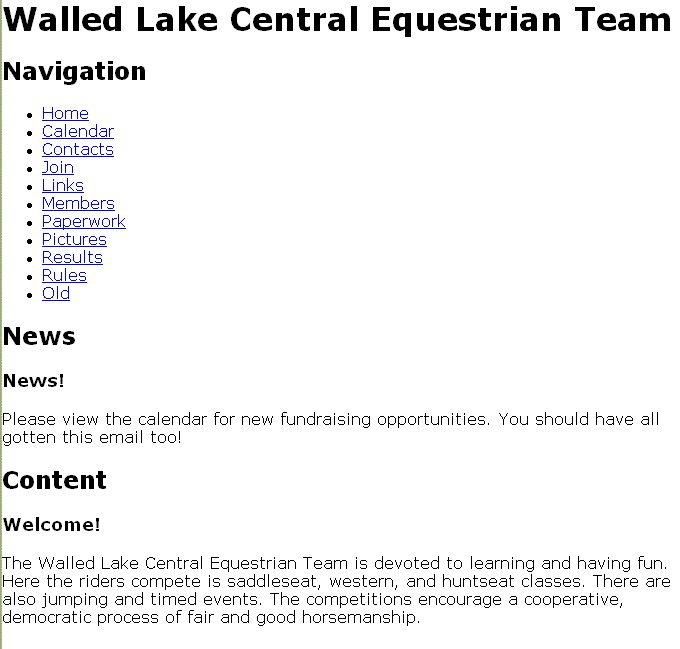 And that produces this not so exciting but quite understandable and almost totally unstyled result. From this point on there should be no need to touch the HTML again. We've got the content down and now the job of presentation begins. It also means that the only code snippets I'll need to include from now on will be styles. That is they'll be part of the embedded style sheet at the top of the page.
Colorize it like Ted used to do
The next thing on our plate is to set the colors and sizes of the structural divisions of the page. It's a lot easier to get these things right quickly if you use Firefox with the ColorZilla and MeasureIt extensions installed. The blue-ish page background color has a value of #3153d8 and the sort of golden background of the content sections is #c58933. After determining the size of the divs that form the wrapper and content areas the stylesheet is updated like so.
html, body {
margin:0;
padding:0;
border: 0;
background:#3153D8;
color:#000;
font-family: Verdana, Geneva, Arial, Helvetica, sans-serif;
font-size: 1em;
text-align: center;
}
div#wrapper {
width: 700px;
margin: 0 auto;
border: 1px solid black;
}
div#nav, div#news, div#content {
background: #C5B933;
}
div#nav, div#news {
width: 170px;
}
div#content {
width: 475px;
}
h2 {
background:#3153D8;
}
h3 {
}
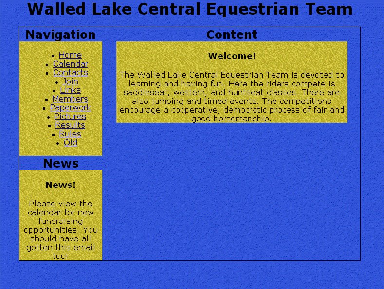
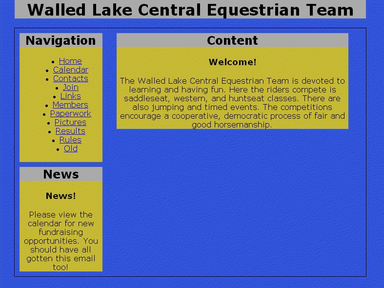
Along with sizing everything there is the matter of centering the overall page (which is contained withing the wrapper div) in the browser window. The div#wrapper style of margin: 0 auto; should do that nicely but to slap training wheels on for Internet Explorer we'll put text-align:center; on the body (the container of div#wrapper). This produces the following result in IE and Firefox respectively.
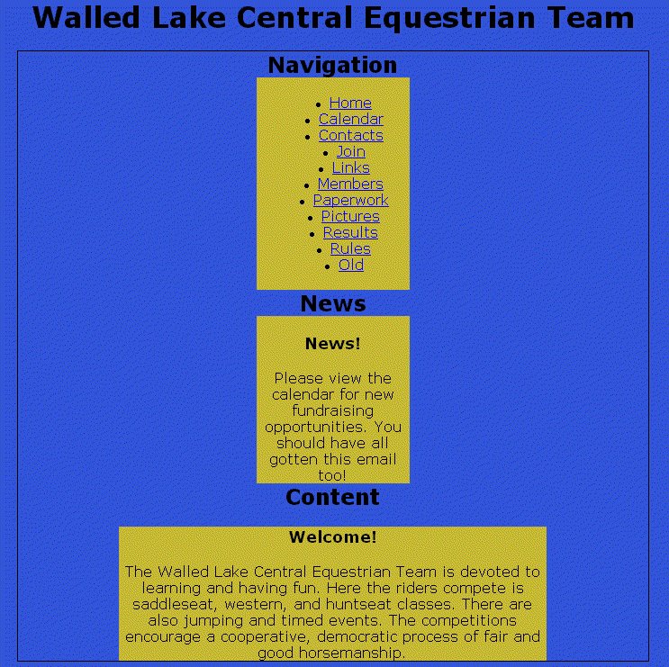
 The difference is because IE mistakenly centers block elements like divs when given the text-align:center style. Believe it or not you just get used to fixing little messes like that as you go. It's also a good example of why you should use a standards compliant browser as your primary preview tool then tweak the layout for IE's problems.
Now push 'em around a bit
With the background colors and div sizes in place, now there's the little issue of putting the divs in the right positions on the page. We'll use float positioning on the Navigation and News divs to put them on the left side of the page. (If you do them one at a time you'll see why the clear is in there.)
div#nav, div#news {
width: 170px;
float: left;
clear: left;
}
 Now that's begining to look a lot like the original design if your eyesight is anywhere as near as bad as mine. There are a couple of other positioning and coloring tweaks that we can do with both the divs and the headings, which haven't been touched yet. Let's give all the div headings a background color so they will show off their placement better. Right now they're the same color as the page background. Eventually the backgrounds will become images but that can wait until near the end.
The other adjustment we'll make in this pass is to put some padding on the wrapper div to space the other divs away from the wrapper border. Hey, everybody needs a little space. In this case I think about 10px will do the job. (We use padding on the wrapper instead of margins around the contained divs to avoid a margin doubling bug in IE.) The news div needs a little top margin to separate it from the navigation. So here's the next set of CSS adjustments and the resulting page.
div#wrapper {
width: 700px;
margin: 0 auto;
padding: 10px;
border: 1px solid black;
}
div#news {
margin-top: 10px;
}
div#content {
width: 475px;
}
h1 {
width: 720px;
background:#aaa;
}
h2 {
background:#aaa;
}
But that nav bar looks so wrong
Now to make that unordered list of links into a real navigation bar...
No comments:
Post a Comment